For the Brochure assignment I created one for a bank and I came to the dilemma of branch locations. As previously, I created the newspaper based of the fictitious town of Mistic I decided to remain in the same area for this project. On my last attempt on creating a fictitious town, Mistic was based on handmade drawings and it was not taking much of consideration to the actual landscape it’s supposed to be based on. This resulted in a flat looking map and me going into the rabbit hole that is the AmherstWorldview project. But for this new version the design will work with the landscape rather than opposite.
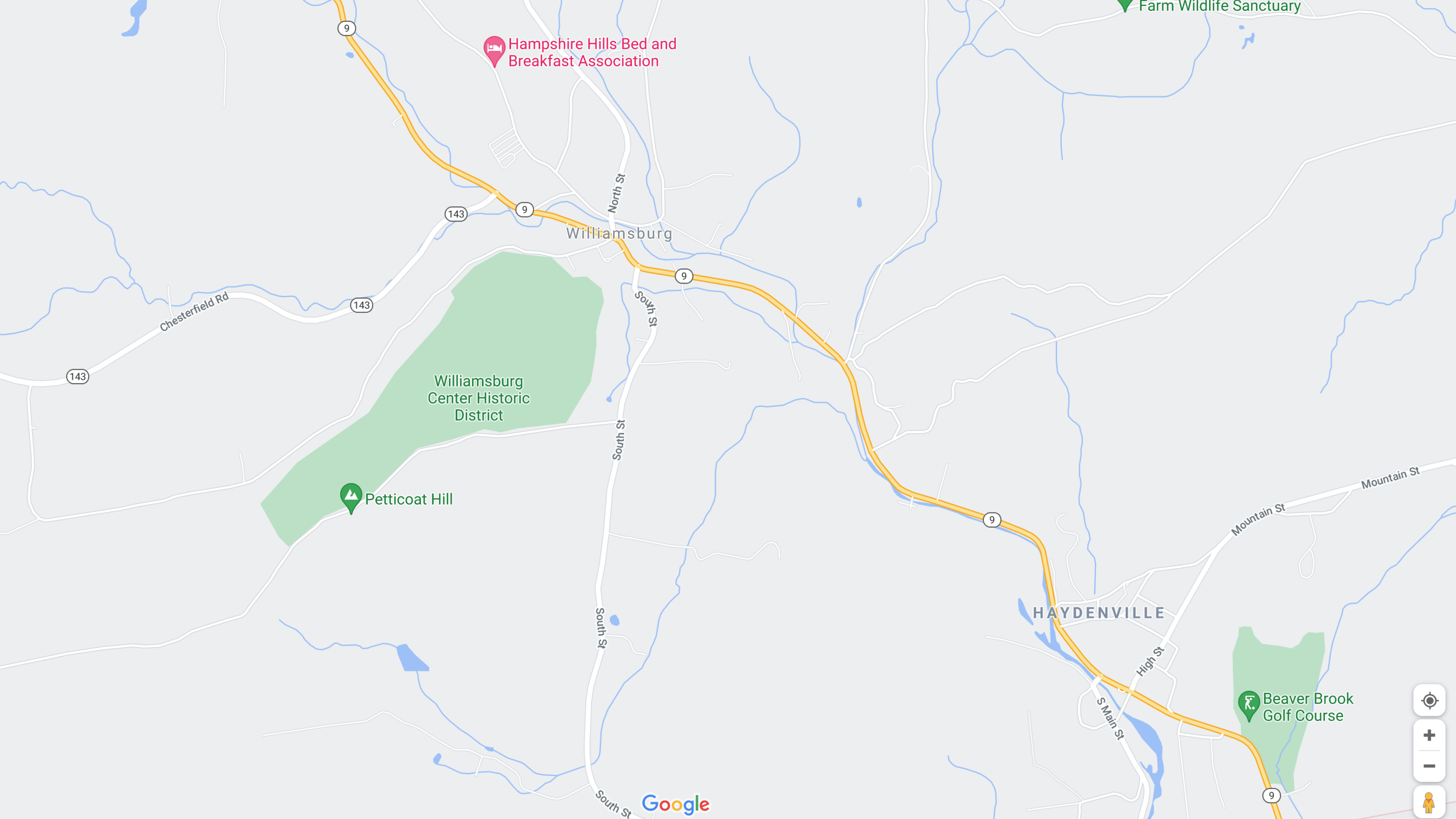
I first examined the actual location Mistic is based on, Williamsburg MA. In real-life Williamsburg is a small Mill Town in the Pioneer Valley, developed around the Meekin Brook, and the Mill River. For this new design Mistic will conform with Williamsburg’s existing layout but will be slightly modified to fit with requirements that the town of Mistic should have. One of them is a more defined town center with a common area encircled by roadways, with strategic locations for both Town Services and citizen needs. A requirement from the previous design was to include a College. Previously Mistic College was located behind the town hall a couple blocks away, this location is no longer possible so it was moved near a forested area were new roads were made.
Comparison of Mistic and its geographical counterpart Williamsburg Massachusetts.
Another requirement was the addition of a railway; emulating the former New York, New Haven & Hartford rail line, but with added passenger service. Besides the requirements, more development in the area was taken to fit with previous renditions, as well with the assumed increase of the population.
Mistic Map with location notes.Town of Mistic (2021 Version)
After the Newspaper Assignment in the Design class we were tasked with creating a brochure. In this task we were required to pick from a set of images that was provided and to create both a Logo and a pattern for the brochure. For the content of the brochure I decided to make a Bank that services the Mistic area. The text presented on the brochure was lifted from a Michigan Bank Brochure and was edited to fit with the services I wanted this new bank to provide. This included the removal of any references of the internet or other web services, which were replaced by Telephone services, and the addition of Massachusetts Depositors insurance fund.
For the assets provided not many edits were needed, only one image was changed so its colors reflect the brand of the bank better. For the brand colors I took inspirations from other local banking institutions in the area and for the logo as well. I designed the logo of the bank as a mill to reflect the history of the fictitious town of Mistic. As a former mill town it made sense to me to make the bank logo a mill and it also helped that the real location Mistic is based on has a river called Mill River.
The logo needed to be simple and recognizable but it also had to work with backlit display signs you’d see on the sides of buildings or above an ATM. It consists of a rectangular blue building with a brown roof adorned with a cupola. With a water wheel attached in the front with subtle wavy lines at the bottom to signify water movement. The white areas are meant to be the most bright areas of sign when backlit.
At first I had some difficulty finding a location to place the pattern, as the examples I saw online did not used one and I wanted to keep a professional look. I decided to place the pattern as the background of the Rates Table, I made a series of floating coins with some transparency to keep it subtle.
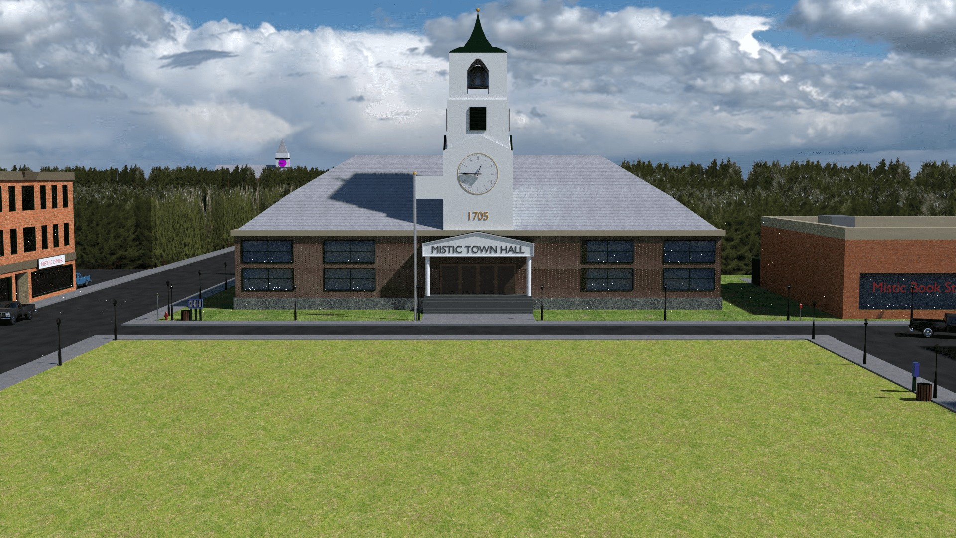
For the physical location of the Bank and its branches I used locations of real banks in Florence and Northampton and replaced them with Mill River Cooperative Bank Branches. The location of the Main Branch and a secondary one within Mistic were difficult make at first as I wasn’t sure where to place them, to solve this question I created a 2D map of Mistic. In the past (2016) I created a 3D render of Mistic based on some ideas I had and took inspiration from real locations throughout Western Massachusetts. But it wasn’t well thought-out plan when you think about the surrounding environments beyond Mistic. The current map is now based on the actual region is emulating. I then added the remaining addresses to the list.
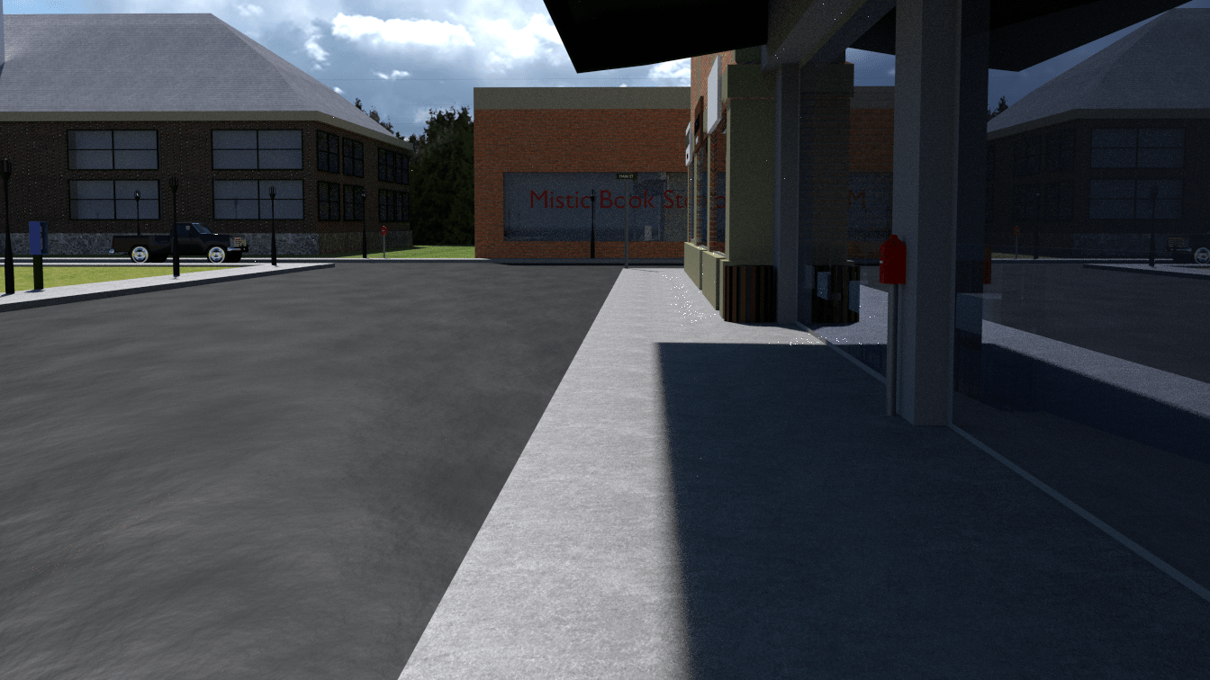
Because it was required to use some of the images provided, I felt using 3D renders alongside real-life images would be jarring to the viewer. I attempted to look for stock images of banks online but none really fit-in with the vision of the project, and opted to use a 3D render instead. This decision was made with not too much time left. I made a 3D building that had some greco-roman influence. I then placed the building in the location it should be in downtown Mistic, using the old Mistic file from 2016. Lastly I needed an image of the Bank’s staff, I ended up using an image from Wikipedia Editors. I used this image because stock images for “Bank Staff” wore too much professional clothing and I wanted to portray a more “down-to-earth” or “relatable” group. The image is under Creative Commons with Attribution.
Mill River Cooperative Bank Brochure (Outer)Mill River Cooperative Bank Brochure (Inner)
For a Design Class I was tasked with creating a newspaper. I started the creation of such by looking at both local and national newspapers. I took heavy inspiration from The Hampshire Gazette, a publication in the Pioneer Valley. I wanted to portray fictitious events and decided to apply it to a fictitious town I created a long time a go. I used Mistic, MA as the location of this publication, and so the Mistic Examiner was born.
Due to the high turn-over rate, I had close to a week to create and finish the newspaper. Most of the time was taken by the design of the layout and the stories that were on the newspaper. We did had the option to use placeholder text but I felt it removed layers of creativity that this project can have. Due to it being set in Mistic, a place only shown through renders. It allowed the possibility of incorporation previous assets into the work. The only new render shown in this project is an image of a rotary phone for a New England Bell advertisement.
It is a similar story for the 2D assets, most of them were imported over to Adobe Illustrator from Moho which had been created in the past for other projects. The maps shown in the project had been used for some animations and was edited to show a gradient of colors to represent temperature maps. The advertisements were made on the spot for those areas in the newspaper, while the weather icons were created for the project.
In terms of the information in the newspaper, accurate weather data was collected. The stories presented in the publication were made to reflect a town with tense local politics, its connection with the state of Massachusetts and the neighboring towns. Some of the information presented was edited from their sources to reflect the fictitious world it came from. These include; addresses, phone numbers, and events.
Mistic Examiner Front Page Mistic Examiner Second PageMistic Examiner Third Page
Right after the creation of my CNC project of the landscape features of Amherst Massachusetts. I wanted to create a fictional Town in the area North of Williamsburg Massachusetts. This Towns name being Mistic the former name Barnstable Mass. I created a paper map of the area and then started to make the town center when I noticed that my original plans didn’t considered geographical gradation of heights making the place look flat. I didn’t took the real world geography into consideration when created the map so I decided to stop with the project and work on some projects that have some sort gradation in height.