


Latest Updates (Blog)
- Vogel Airlines Shorts
Vogel Airlines is a short video series of advertisements of a fictitious airline. These are supposed to evoke the former glamour flying had in the past. While also contrasting it realities beyond the touristic bubble. These shorts are presented as advertisements the viewer would have see on TV or on their phone before. The shorts were released with different lengths, edits and language. Below are the descriptions of these shorts:
Vogel Airlines
The video uses imagery to invoke thoughts of a “relaxing” or “Perfect” vacation. These are then superseded with shots of an aircraft and the company logo with a narration.
The length is 33 Seconds.
The short was distributed in specific areas on the West Coast, Midwest and Northeast.
Vogel Airlines “Extended”
This video is much shorter, emulating a long running TV commercial which are cut to be made shorter after its initial release. The cut was also taking in consideration the time given to a user before they can skip an ad. When the user is about to click the skip button, the video changes revealing the reality behind the picture-perfect representation of the Ad. Contrasting imagery that breaks the user’s expectations allowing the opportunity for them to watch until the end.
The length is 24 Seconds.
The short was distributed in specific areas on the West Coast, Midwest and Northeast.
Vogel Airlines (Spanish)
Inspirations
This animation was initially part of a larger project and would have acted as a transition point. As the idea kept developing it took a life of its own and became the Vogel Airlines project. The idea of making a fake ad is not new to me. What has abstained me from making one in the past is the balance I’d want to have between a serious ad and a critical one. A serious one is just an Ad, but a critical one would use the same tactics an Ad would use but applying it as a subversion against itself.
An aspect I wanted to emulate in this animation was my experience watching TV in Puerto Rico. Puerto Rico being a U.S. Territory; media coming from the mainland is rather ubiquitous, from Movies, TV Shows, Music, Ads and Slang. Slowly but surely arrives to the island either as the raw creation (like in music) or is translated to Spanish but still keeps its Nationally albeit edited to fit with logistical and market restrictions (due to being an unincorporated territory). For advertising (circa early 2000’s); broadcasted ads had this unique feel to them. Of being noticeably dubbed while also having this old look to them. It would be common to see an Ad from the 90s still being broadcasted even though a newer version of the same Ad was already distributed in the mainland. This gave a feeling of stagnation yet at the same time comfort. This might be due to the multiple economical issues Puerto Rico has faced since the 90’s to this day. A noticeable shift in Advertising in the late 2000’s was the usage of Ads that have been produced for the Spanish-speaking population in the mainland, and came with cultural cues that are not fully present in the Island.
Part of the inspiration also came from the nature of economies based around tourism. In Puerto Rico tourism is one of the major if not biggest industries on the island. Due to this there is a noticeable shift in attention from leaders towards maintaining and beautifying areas that tourist are more likely to gather. Leaving less popular areas under maintained and visually unpleasant. This can be seen more apparent in the condition of roads, roads that are signed and marked as routes for tourist are well maintained that routes taken more often by locals. This can be seen as an obvious decision from leaders but it creates this “backlot look” to the surroundings beyond tourist designated areas. As a host hiding a messy room behind a door, leaders have done the same with how they concentrate their efforts on keeping up an appearance even if it’s a detriment to the local population that has no casual reason to visit those areas.
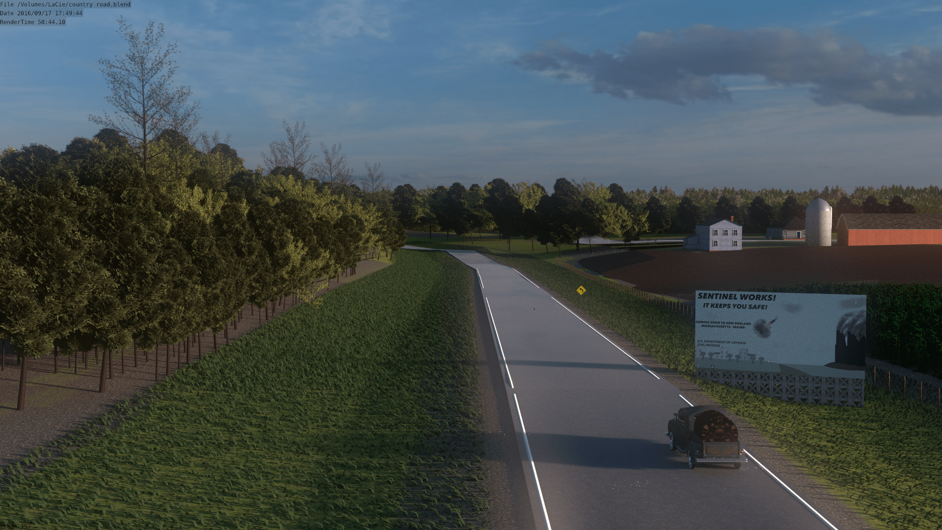
Advertising the Ads
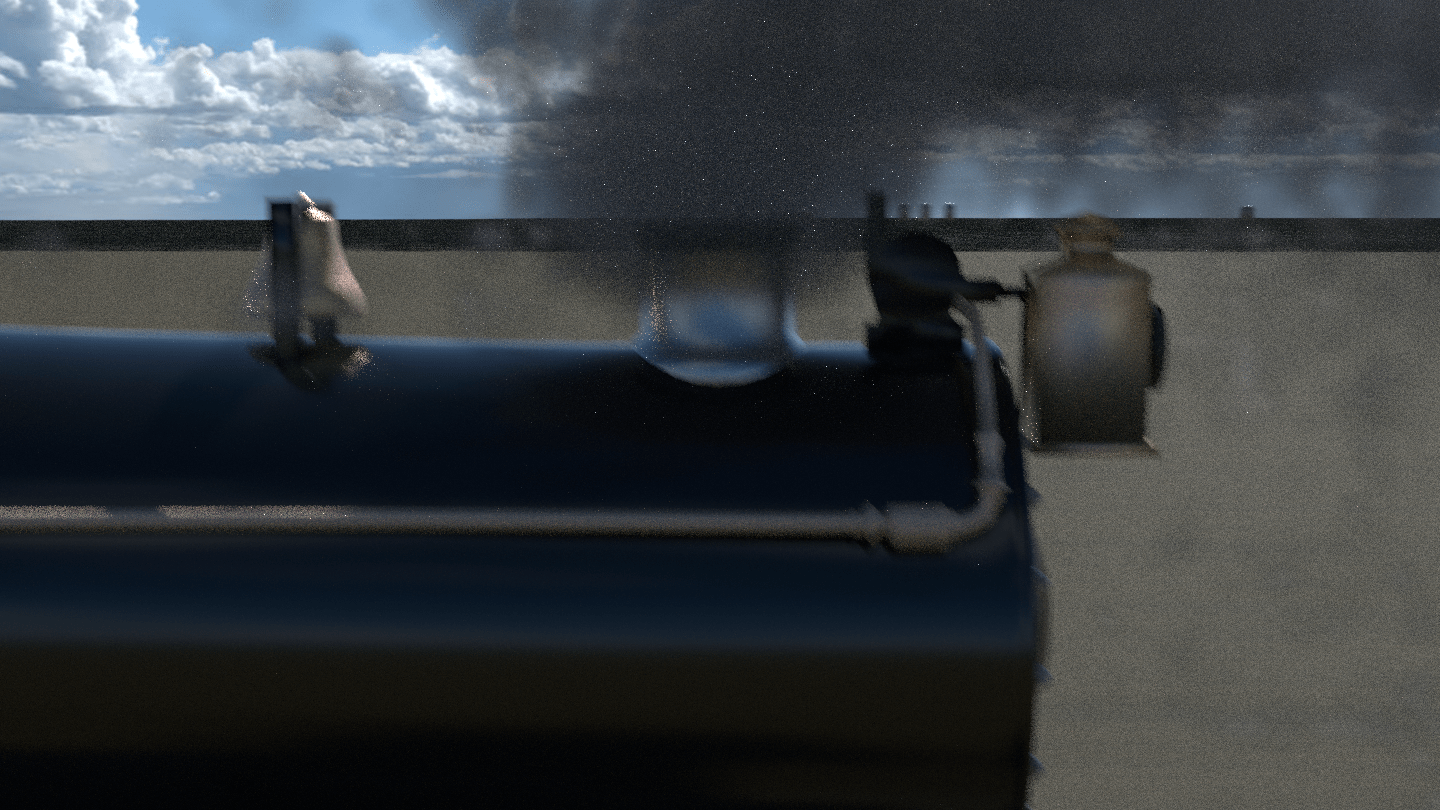
Due to the experience these shorts were trying to create. These shorts were distributed as Ads across the US. More information about the process and results will be posted on a later date.
- Munch-Man Arcade Machine

Munch-Man
This arcade machine was made was made alongside others to be used as props for a previous animation. It was supposed to act as the in-universe version of Pac-Man.
Measures: 2.85 feet in length, 3.27 feet in width, and 5.71 feet in height.
Artwork done in Moho and Photoshop Animations for the screen done in Moho and edited in Final Cut Pro Modeled in Blender

Munch-Man Arcade machine - The Mistic Examiner
Newspaper Design
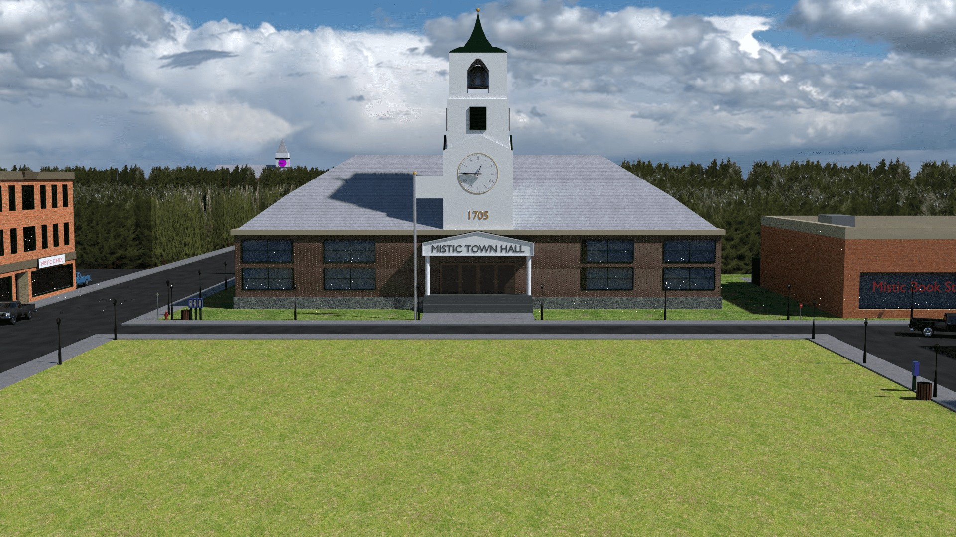
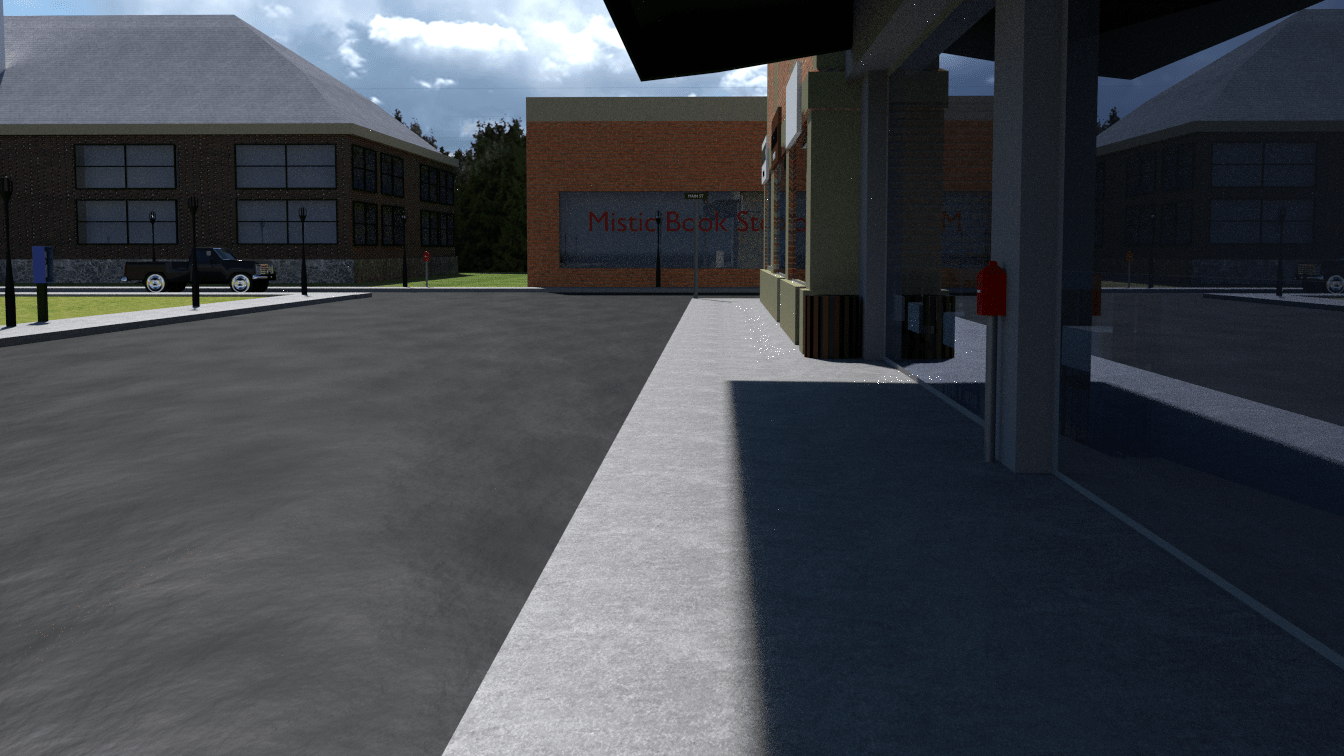
For a Design Class I was tasked with creating a newspaper. I started the creation of such by looking at both local and national newspapers. I took heavy inspiration from The Hampshire Gazette, a publication in the Pioneer Valley. I wanted to portray fictitious events and decided to apply it to a fictitious town I created a long time a go. I used Mistic, MA as the location of this publication, and so the Mistic Examiner was born.
Due to the high turn-over rate, I had close to a week to create and finish the newspaper. Most of the time was taken by the design of the layout and the stories that were on the newspaper. We did had the option to use placeholder text but I felt it removed layers of creativity that this project can have. Due to it being set in Mistic, a place only shown through renders. It allowed the possibility of incorporation previous assets into the work. The only new render shown in this project is an image of a rotary phone for a New England Bell advertisement.
It is a similar story for the 2D assets, most of them were imported over to Adobe Illustrator from Moho which had been created in the past for other projects. The maps shown in the project had been used for some animations and was edited to show a gradient of colors to represent temperature maps. The advertisements were made on the spot for those areas in the newspaper, while the weather icons were created for the project.
In terms of the information in the newspaper, accurate weather data was collected. The stories presented in the publication were made to reflect a town with tense local politics, its connection with the state of Massachusetts and the neighboring towns. Some of the information presented was edited from their sources to reflect the fictitious world it came from. These include; addresses, phone numbers, and events.

Mistic Examiner Front Page 
Mistic Examiner Second Page 
Mistic Examiner Third Page - Everlasting Expansions
Times is constantly moving forward and it does not care what it leaves behind, it aids the creation of the universe, galaxies and their demise. As long as it keeps moving so will the Everlasting Expansions of our Universe. Made in 2017

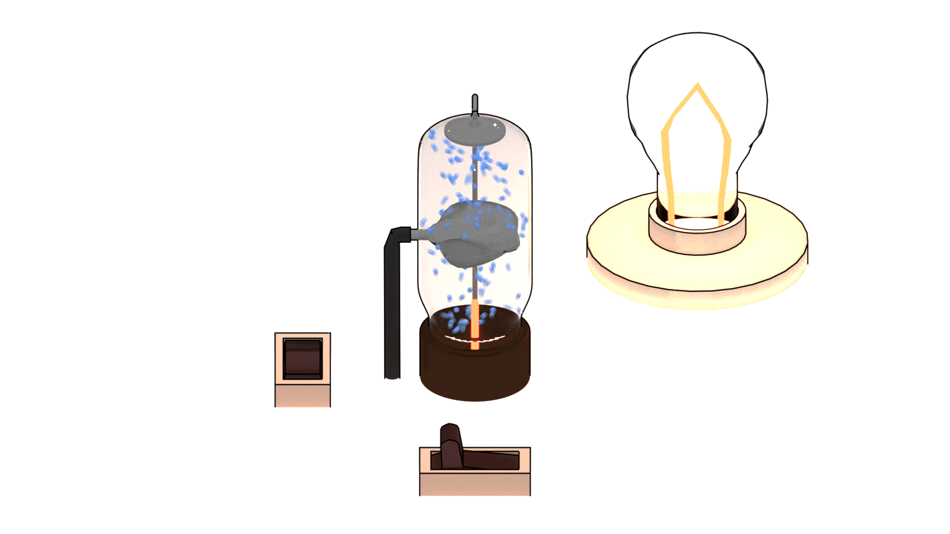
Tube Transistor

Steam Engine

Ocean Foam

Neutron

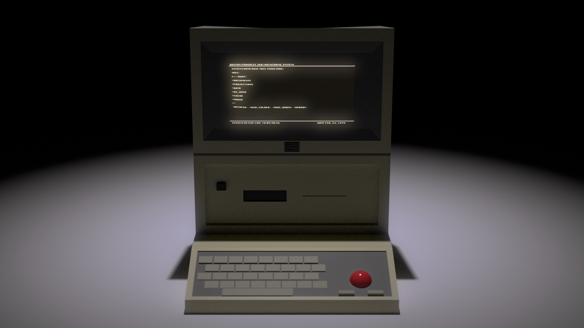
Boston Progress Personal Computer Model II
- The Mistic Project
 Right after the creation of my CNC project of the landscape features of Amherst Massachusetts. I wanted to create a fictional Town in the area North of Williamsburg Massachusetts. This Towns name being Mistic the former name Barnstable Mass. I created a paper map of the area and then started to make the town center when I noticed that my original plans didn’t considered geographical gradation of heights making the place look flat. I didn’t took the real world geography into consideration when created the map so I decided to stop with the project and work on some projects that have some sort gradation in height.

 Made in 2015